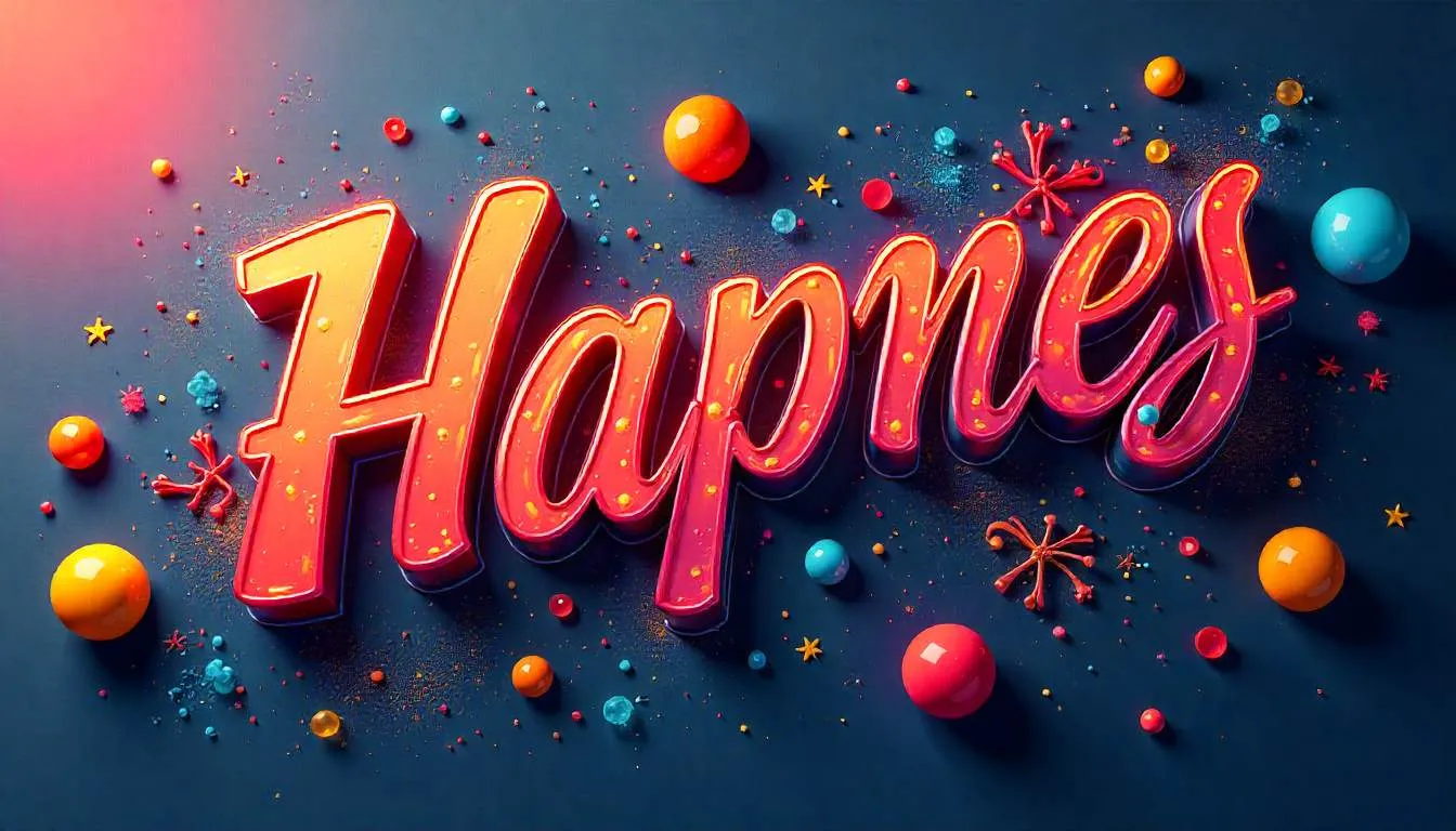
Kinetic Typography & Tactile Maximalism: The Return of Human Design
Kinetic Typography & Tactile Maximalism: Why “AI-Perfect” Design Is Dead (and Human Messiness Is Back)
Key Takeaways
- Flat, hyper-minimal “AI-perfect” design is losing emotional impact.
- Users now crave human fingerprints: motion, texture, imperfection, and tactility.
- Kinetic typography and tactile maximalism increase engagement, recall, and delight.
- Brands like Blinkit prove that playful, touch-responsive UI drives real business results.
- The future of design blends AI precision with human imperfection, not one or the other.
When Did Everything Start Looking… the Same?
Open five apps right now.
White background.
Rounded cards.
San-serif text.
Subtle shadows.
It’s clean.
It’s efficient.
And somehow… it’s forgettable.
Here’s the uncomfortable truth designers and marketers are starting to admit in 2026:
AI didn’t just democratize design. It flattened it.
When everything is “perfect,” nothing feels human anymore.
That’s why kinetic typography, tactile maximalism, and emotionally messy design are roaring back—not as rebellion, but as reconnection.
The Problem: Flat Design Optimized the Soul Out of Digital Experiences
Flat design made sense once.
It solved real problems:
- Faster load times
- Clear visual hierarchy
- Mobile-first clarity
But over time, it became doctrine.
What Went Wrong
As AI tools accelerated UI production:
- Interfaces became technically flawless
- Layouts followed the same grids
- Motion was reduced to safe micro-animations
The result?
- Lower emotional engagement
- Faster visual fatigue
- Brands that felt interchangeable
For marketers, this created a quiet crisis:
- Ads blended into feeds
- Interfaces didn’t stick in memory
- Differentiation got harder, not easier
Ignoring this shift means:
- More spend for the same attention
- Lower brand recall
- Younger users disengaging faster than ever
The Reversal: Why “Human” Is the New Premium
In 2026, perfection is cheap.
What’s rare—and valuable—is character.
Users don’t want:
“Another beautifully aligned interface.”
They want:
“Something that feels alive.”
That’s where kinetic typography and tactile maximalism come in.
What Is Kinetic Typography (Really)?
Kinetic typography isn’t just moving text.
It’s text that:
- Reacts to scroll
- Responds to touch
- Breathes, stretches, shakes, or stutters
- Mirrors emotional tone
Think:
- Headlines that pulse slightly
- Words that drift apart under pressure
- Text that feels performed, not placed
This style works because language becomes physical, not passive.
What Is Tactile Maximalism?
Tactile maximalism rejects sterile flatness.
It embraces:
- Depth
- Texture
- Gloss
- Bounce
- Exaggeration
Key traits include:
- High-gloss 3D icons
- Inflating buttons
- Overlapping layers
- Bold color contrasts
- Playful physics
This isn’t chaos. It’s designed excess.
Case Study: Blinkit’s “Satisfying Shop” UI
Blinkit understood something critical:
Grocery shopping shouldn’t feel like filling out a form.
The Problem
Digital grocery apps felt cold and transactional. Efficient—but emotionally empty.
The AI-Driven Design Shift
Blinkit leaned into tactile maximalism:
- Icons gained high-gloss, 3D textures
- Buttons bounce and inflate on hover
- Micro-animations mimic physical touch
Everything feels:
- Touchable
- Responsive
- Slightly playful
The Result
- 22% increase in micro-interactions
- Higher brand recall with Gen Z
- More “satisfying” sessions users wanted to repeat
This wasn’t decoration. It was emotional UX strategy.
Why This Works: The Psychology Behind It
1. Motion Signals Life
Humans are wired to notice movement. Kinetic typography activates attention without shouting.
2. Imperfection Signals Authenticity
Asymmetry and hand-drawn elements feel:
- Crafted
- Intentional
- Human
They signal effort, not automation.
3. Touch Simulation Builds Memory
Tactile responses activate sensorimotor memory. That’s why these interfaces are easier to recall later.
This aligns with emerging research on embodied cognition—how physical sensation impacts digital perception, a topic explored deeply in modern UX studies and echoed across AI-first design frameworks.
How to Apply Kinetic Typography Without Overdoing It
This is where many teams fail.
Step 1: Choose One Emotional Anchor
Ask:
- Playful?
- Bold?
- Rebellious?
- Warm?
Your motion style must match your brand tone.
Step 2: Animate Meaning, Not Decoration
Good kinetic typography:
- Emphasizes key words
- Reflects sentiment
- Guides attention
Bad kinetic typography:
- Distracts
- Loops endlessly
- Slows comprehension
Step 3: Use Constraints
Limit:
- Animation speed
- Frequency
- Scope
Less motion, used intentionally, feels premium.
Bento Grid 2.0, Glassmorphism, and Brutalist AI Design
These trends aren’t random. They’re responses to the same problem.
Bento Grid 2.0
- Structured, but playful
- Modular yet expressive
- Perfect for maximalist motion
Glassmorphism (Done Right)
- Depth without clutter
- Soft translucency
- Works beautifully with kinetic layers
Brutalist AI Design
- Raw
- Opinionated
- Anti-polish
Together, they form a design language that says:
“A human was here.”
Where AI Fits (Without Killing the Vibe)
AI isn’t the enemy.
Soulless design is.
Modern teams use AI to:
- Generate variations
- Test motion patterns
- Optimize performance
But humans define the aesthetic rules.
Platforms like SaaSNext (https://saasnext.in/) help teams orchestrate AI workflows while keeping creative control—ensuring automation enhances expression instead of flattening it.
Common Questions (AEO-Optimized)
Is Flat Design Completely Dead?
No—but it’s no longer sufficient on its own.
Does Kinetic Typography Hurt Accessibility?
Not if done responsibly. Motion can adapt to user preferences and reduce intensity automatically.
Is This Trend Only for Gen Z?
Gen Z leads it, but all users respond to emotional clarity and tactile feedback.
Can AI Design Tools Support This Style?
Yes—when paired with strong human creative direction.
How Brands Should Start (Without a Redesign)
You don’t need to blow up your UI.
Start small:
- Animate one headline
- Add tactile feedback to one CTA
- Introduce one playful micro-interaction
Measure:
- Hover time
- Interaction depth
- Recall
Iterate.
This incremental approach is how many teams working with SaaSNext pilot emotionally intelligent UI experiments before scaling them across products.
The Bigger Shift: From Efficiency to Feeling
For years, digital design optimized for:
- Speed
- Clarity
- Consistency
Now it must optimize for:
- Emotion
- Memory
- Identity
Kinetic typography and tactile maximalism aren’t trends. They’re symptoms of a deeper hunger for humanity in digital spaces.
The Future Isn’t Messy by Accident
It’s messy on purpose.
In a world where AI can generate perfect layouts in seconds, imperfection becomes a brand advantage.
The brands that win in 2026:
- Let text move
- Let buttons breathe
- Let interfaces feel touched, not rendered
Because users don’t remember perfection.
They remember feeling something.
If this resonated:
- Share it with your design or marketing team
- Subscribe for more insights on human-centered AI design
- Explore how SaaSNext helps teams balance automation with creativity at scale
Design isn’t dying.
It’s becoming human again.