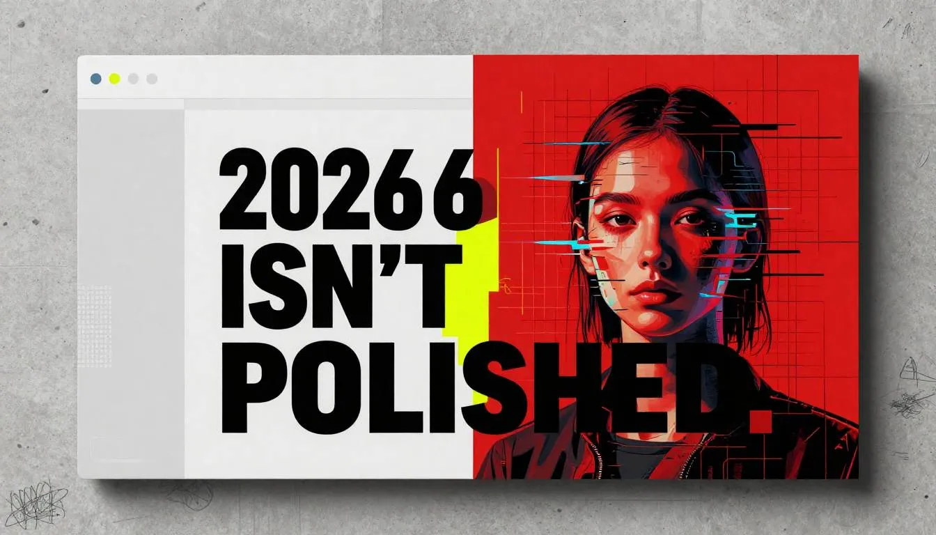
Neo-Brutalism Meets AI: The Raw, Honest Aesthetic Redefining 2026 Design
Ever feel like your designs are drowning in polish?
You spend hours tweaking shadows, aligning pixels to the micron, choosing “just the right” neutral tone… only to end up with something that feels safe, forgettable, and weirdly soulless?
You’re not alone.
Across Dribbble, Behance, and Figma files worldwide, a quiet fatigue is setting in. The “clean minimalist” era—once revolutionary—has calcified into a visual monoculture. Everything looks like it was birthed from the same Apple-inspired design system: soft corners, pastel gradients, and ghost buttons that vanish into the void.
But something raw is rising.
Enter Neo-Brutalism: unapologetically bold, deliberately imperfect, and emotionally direct. And now, it’s colliding with AI-native branding in ways that are reshaping 2026 design aesthetics from the ground up.
This isn’t just another trend to chase. It’s a rebellion—and a reset.
The Problem: When “Good Design” Becomes Invisible
For years, we’ve been taught that good design is invisible. “It should get out of the way,” they said. “Users shouldn’t notice it.”
But here’s the unintended consequence: when everything recedes, nothing stands out.
Your portfolio blends into the feed.
Your app icon disappears among 200 others.
Your client’s brand feels… generic.
Worse, AI tools have amplified this problem. Early AI image generators defaulted to smooth, dreamy, hyper-aestheticized outputs—reinforcing the same visual tropes designers were already tired of. The result? A feedback loop of sameness.
If you ignore this shift, you risk becoming visually irrelevant. Not because your skills are lacking—but because your aesthetic language no longer cuts through the noise.
People don’t crave perfection anymore.
They crave authenticity.
They crave texture.
They crave humanity—even (especially) in digital spaces.
Neo-Brutalism answers that call. And when fused with intelligent AI workflows, it becomes more than a style—it becomes a strategy for connection.
The Solution: How to Harness Neo-Brutalism + AI for 2026’s Visual Storytelling
Neo-Brutalism isn’t just “ugly design.” It’s honest design. Think high-contrast typography, clashing colors, exposed grids, jagged edges, and intentional “flaws” that signal: a human made this.
Now, pair that with AI that understands context, not just pixels—and you’ve got a powerhouse for AI-native branding.
Here’s how to do it—without burning your portfolio to the ground.
1. Start with Intention, Not Aesthetics
Neo-Brutalism fails when it’s just visual noise. It succeeds when it serves story.
Ask:
What emotion should this evoke?
What message must be impossible to ignore?
For example:
- A climate activist campaign? Use jarring reds, uneven text blocks, and glitch effects to convey urgency.
- A punk music label? Embrace misaligned logos, ransom-note typography, and pixelated imagery.
Why it works: In a world of algorithmically smoothed content, raw visuals trigger cognitive dissonance—which grabs attention and boosts recall.
How to apply it: Before opening Figma or MidJourney, write a one-sentence emotional brief: “This design should feel like ______.” Let that guide every visual decision.
2. Use AI as a Brutalist Co-Creator—Not a Polish Machine
Most designers use AI to refine. For Neo-Brutalism, use it to disrupt.
Instead of prompting “a clean, modern landing page,” try:
- “A chaotic, high-energy website for a streetwear brand, using only Helvetica Bold, blood red, and concrete textures—no gradients, no icons.”
- “A poster with torn paper edges, overlapping mismatched fonts, and a distorted AI-generated portrait in the center.”
Pro tip: In tools like Adobe Firefly or MidJourney v7, use negative prompts like --no smooth, --no soft shadows, --no symmetry to force rawness.
Why it works: AI can generate 50 variations of “imperfect” in seconds—something that would take hours to hand-craft. You curate the chaos.
Real-life example: Designer Lena Chen used AI to generate 100 distorted logo concepts for a mental health app, then hand-selected the three most emotionally resonant—keeping the rough edges intact.
3. Embrace “Controlled Ugliness” in UI/UX
Yes, even in interfaces.
Neo-Brutalist UI doesn’t mean sacrificing usability—it means prioritizing clarity over comfort.
Try these techniques:
- Bold, oversized typography that dominates the screen (Futura, Impact, or custom grotesques)
- High-contrast color palettes (black/white/yellow, red/white, electric blue on raw concrete)
- Visible grids and alignment lines as design elements
- Animated “glitches” on hover to signal interactivity
“Users don’t need everything to feel safe. They need to know what to do next.”
— UI designer Marco Ruiz, 2025
Why it works: In cluttered digital environments, extreme clarity cuts through. A bright red button with jagged edges? You notice it. You click it.
For students: Build one Neo-Brutalist app screen in your portfolio. Not to replace your clean designs—but to show range, courage, and conceptual thinking.
4. Build AI-Native Branding Systems (Not Just Logos)
2026’s brands aren’t static. They’re adaptive, generative, and contextual.
Use AI to create:
- A dynamic logo that changes texture based on weather data
- A color system that shifts hue depending on user sentiment (e.g., cooler tones for sad inputs)
- Typography that degrades over time, mimicking physical wear
This is AI-native branding: where identity lives in rules and behaviors, not just fixed assets.
How to start: Use tools like Runway ML or Stable Diffusion with LoRAs (Low-Rank Adaptations) to train custom visual styles based on your Neo-Brutalist mood board. Then deploy them programmatically.
5. Answer the Big Questions Head-On
Let’s tackle what you’re really wondering:
Q: Isn’t Neo-Brutalism just lazy design?
A: No—thoughtless Neo-Brutalism is lazy. True Neo-Brutalism is highly intentional. It removes decoration to amplify message. There’s a difference between “messy” and “meaningfully raw.”
Q: Will clients hate it?
A: Some will. But the right clients—the ones who want to stand out—will love it. Position it as “anti-algorithm design” for brands that refuse to blend in.
Q: Can this work for corporate or healthcare projects?
A: Absolutely—if adapted. A hospital app might use bold typography for emergency info, high-contrast alerts, and uncluttered data displays. Brutalism = clarity under pressure.
Q: What about accessibility?
A: Neo-Brutalism can enhance accessibility: high contrast helps low-vision users; clear typography aids dyslexia. Just test your color combos and hierarchy.
The Bigger Picture: Why This Matters Beyond Aesthetics
Neo-Brutalism + AI isn’t just about looking different. It’s a response to a deeper human need: to feel real in a synthetic world.
Every time an AI smooths a photo, softens a voice, or rounds a corner, it erases a little more of our humanity.
Neo-Brutalism pushes back.
It says: I’m here. I’m flawed. I’m not trying to please you—I’m trying to be seen.
And in 2026, that’s the most powerful form of visual storytelling there is.
Your Turn: Don’t Just Follow Trends—Set Them
You don’t need to go full punk overnight. But try this:
- This week: Redesign one project with Neo-Brutalist rules—no rounded corners, no gradients, one bold typeface, two clashing colors.
- This month: Train a custom AI style using your hand-drawn textures or scanned collage elements.
- This year: Build a personal brand that feels like you—not like a design system template.
The future of 2026 design aesthetics belongs to those who dare to be imperfect.
So go make something that feels real.
→ Share your Neo-Brutalist experiments with #RawDesign2026
→ Download our free “Neo-Brutalism + AI Prompt Kit” (link in bio)
→ Tag a designer who’s tired of playing it safe
The algorithm rewards sameness.
But humans reward courage.
Be human.