Squishy-Uishy UI: Why Tactile Maximalism Is Winning in 2026
“Squishy-Uishy” UI: The Rise of Tactile Maximalism
Flat design is dead. Long live the inflatable interface.
🔑 Key Takeaways
- Flat, sterile UI is losing trust and emotional pull in an AI-saturated world
- 2026 design trends favor tactile maximalism: squishy, imperfect, almost touchable interfaces
- “Squishy-Uishy” UI is not aesthetic chaos — it’s a conversion and differentiation strategy
- CFOs and founders should see design as a revenue lever, not a cosmetic expense
- Brands that feel human outperform brands that merely look efficient
- AI-era products win by signaling warmth, presence, and personality — not perfection
Why Does Everything Feel… the Same?
Open five SaaS products right now.
Different logos. Different promises.
But somehow — the same feeling.
White backgrounds.
Perfect spacing.
Rounded rectangles that all obey the same invisible grid.
It’s clean. It’s efficient.
And it’s completely forgettable.
Here’s the uncomfortable truth most teams don’t want to hear:
In 2026, flat design doesn’t signal professionalism anymore — it signals cheapness and AI-generated sameness.
Users can feel it. Investors can feel it. Even your CFO subconsciously feels it when churn creeps up and CAC rises.
Design has entered its rebellion era.
The Problem: “AI-Sterile” Design Is Quietly Killing Differentiation
When Minimalism Becomes a Liability
Minimalism worked when:
- Software was hard
- Trust was scarce
- Clarity was the main problem
But now?
AI builds clean UIs by default.
Every tool can generate “good enough” interfaces in seconds.
So when everything looks clean, clean stops being special.
The Hidden Business Cost of Sterile UI
For founders and CFOs, the danger isn’t aesthetic — it’s economic.
AI-sterile design leads to:
- Lower brand recall
- Faster feature commoditization
- Reduced emotional attachment
- Higher price sensitivity
If users can’t feel your product, they won’t fight to keep it.
And in a world of infinite alternatives, that’s fatal.
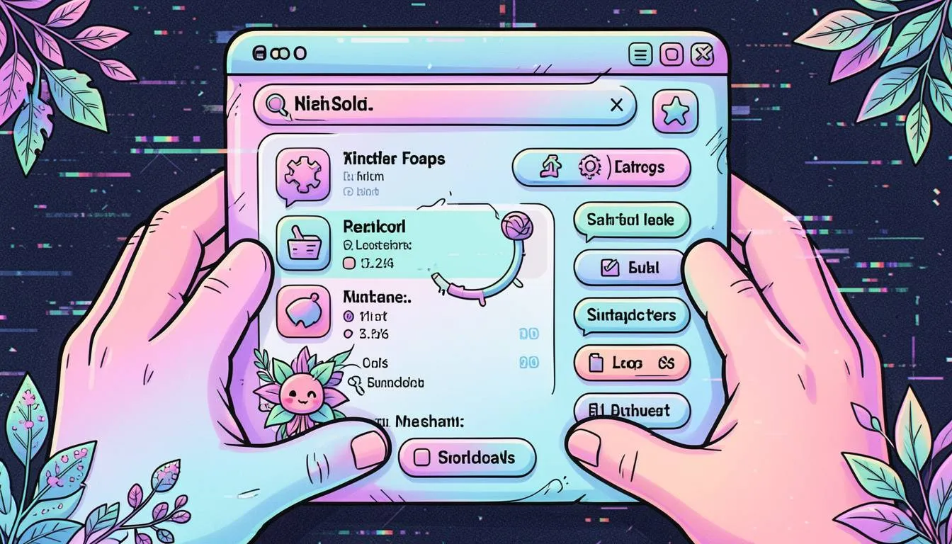
Enter “Squishy-Uishy” UI: Design You Can Almost Touch
What Is Tactile Maximalism?
Squishy-Uishy UI (yes, the name is intentionally unserious) describes a broader shift toward:
- Inflatable, soft-looking elements
- Visible depth, shadows, and pressure
- Imperfect motion and micro-jank
- Glitch aesthetics and nostalgia cues
- Tech-organic blends (“mechanical flora”)
Think less “Apple landing page”
More “this interface feels alive.”
Why 2026 Interfaces Feel Squeezable
This trend isn’t random. It’s a reaction.
AI made:
- Code cheap
- Layouts generic
- Perfection effortless
So design is doing the opposite.
Imperfect by design.
Messy on purpose.
Human on principle.
The Psychology Behind the Squish
1. Tactility Signals Trust
Humans evolved touching things to verify they’re real.
In digital products:
- Depth = substance
- Texture = effort
- Imperfection = humanity
Flat design feels like a stock photo.
Tactile design feels handmade.
2. Maximalism Creates Memory
You don’t remember the fifth minimal dashboard you saw today.
You do remember:
- The interface that wobbled slightly
- The button that looked inflatable
- The UI that felt playful, strange, or nostalgic
Memory is the real moat.
3. Nostalgia Lowers Cognitive Defenses
Design references like:
- Heisei retro
- Early-2000s skeuomorphism
- CRT glitches and pixel softness
These trigger comfort, not skepticism.
That matters when users are increasingly wary of AI.
Case Study: A Fictional—but Very Real—Pattern
Case Study: A Fintech Dashboard That Stopped Looking “Smart”
A mid-stage fintech (Series B) noticed a problem:
- Traffic was growing
- Conversions were flat
- Brand recall was weak
Their UI was perfect — and completely indistinguishable from competitors.
They introduced:
- Soft, inflated data cards
- Subtle “breathing” animations
- Organic divider lines inspired by plant veins
- Micro-imperfections in motion timing
Results over 90 days:
- +18% demo conversion
- +22% brand recall in user surveys
- Lower perceived “AI-generated” sentiment
No pricing changes. No feature changes.
Just feel.
The CFO Angle: Why This Isn’t “Design Fluff”
Let’s talk money.
Design Is Now a Cost-Control Mechanism
When your product feels:
- Generic → users compare on price
- Human → users compare on trust
Trust reduces:
- Churn
- Support load
- Discount pressure
That’s not art. That’s margin protection.
The False Economy of “Cheap” Design
AI makes it tempting to say:
“Good enough UI is fine.”
But “good enough” design:
- Shortens product half-life
- Forces faster feature churn
- Increases marketing spend
You end up paying later — just not in the design budget.
How to Apply Squishy-Uishy UI Without Burning Cash
This is where founders panic.
Good news: this isn’t about rebuilding everything.
Step 1: Add Depth Before Decoration
Start with:
- Layered cards
- Softer shadows
- Slight parallax
Depth alone increases perceived quality.
Step 2: Introduce Imperfect Motion
Avoid robotic easing.
Use:
- Slightly uneven durations
- Organic acceleration
- Micro-delays
Perfection feels fake in 2026.
Step 3: Let One Element Be Weird
Not the whole app.
Just one:
- A playful loading state
- A squishy primary CTA
- A glitchy empty state
One memorable moment beats total polish.
Step 4: Measure Feeling, Not Just Funnels
Add qualitative signals:
- “How did this product feel?”
- “Did it feel human or automated?”
These answers predict retention better than heatmaps.
Where AI and Design Actually Work Together
Here’s the irony:
AI made sterile design common.
But AI also makes custom design cheaper than ever.
Platforms like SaaSNext help teams orchestrate AI workflows so designers and product teams can:
- Prototype expressive UI faster
- Test multiple aesthetic directions
- Automate experimentation without bloated costs
Instead of fighting AI, the best teams use it to amplify taste.
You can explore how SaaSNext supports creative automation here:
👉 https://saasnext.in/
Strategic Links for Deeper Context
-
Internal: SaaSNext on AI-driven product workflows
👉 https://saasnext.in/ -
External: Nielsen Norman Group on emotional design and usability
👉 https://www.nngroup.com/articles/emotional-design/
These reinforce a key point: usability and emotion are no longer opposites.
Why Indie Hackers Are Leading This Trend
Budget-conscious builders feel this fastest.
They can’t outspend competitors.
So they out-feel them.
A memorable interface:
- Buys time
- Earns forgiveness
- Creates word-of-mouth
In crowded markets, vibe is strategy.
The Bigger Picture: Design as Anti-AI Signaling
In 2026, users subconsciously ask:
“Was this made by someone… or something?”
Squishy-Uishy UI answers:
“A someone cared.”
That signal is becoming priceless.
The Screen Is No Longer a Sheet of Glass
Flat design treated screens like windows.
2026 design treats them like objects.
Objects you can:
- Press
- Squeeze
- Feel
In a world where AI can generate infinite perfection, imperfection becomes the brand.
The companies that win won’t look the cleanest.
They’ll feel the most alive.
If you’re a founder or CFO:
- Re-audit your product’s emotional ROI
- Ask if your UI feels human or mass-produced
- Share this with your design and product leads
And if you want to explore how AI can support — not sterilize — your product experience, take a look at SaaSNext and how teams use it to orchestrate expressive, human-centered systems.
Because in 2026, people don’t fall in love with features.
They fall in love with feeling something.