Tactile Maximalism & Generative UI: Why Flat Design Is Ending in 2026
Let’s be honest.
Your website looks… fine. Clean. Minimal. Safe.
And your users?
They’re bored out of their minds.
In 2026, the biggest threat to digital growth isn’t bad UX—it’s forgettable UX. Flat buttons, polite shadows, and sterile grids no longer excite anyone scrolling at 120Hz on OLED screens. Users don’t want interfaces that sit there. They want interfaces that react, squish, bounce, shimmer, and feel alive.
Welcome to the era of Tactile Maximalism—where UI doesn’t just respond, it deforms.
Where design isn’t static, it’s performative.
Where you stop designing screens… and start designing intent models.
Why This Shift Is Happening Now
Design trends don’t change because designers get bored.
They change because user behavior does.
Three forces collided in 2026:
- Touch-first generations raised on haptics, gaming physics, and spatial UI
- AI-generated interfaces that adapt in real time
- Attention scarcity at an all-time high
Flat design—once a rebellion against skeuomorphism—has become the new corporate beige.
The internet didn’t get uglier.
It got emotionless.
The Problem: Flat Design Is Killing Engagement
1. Everything Looks the Same
Open five e-commerce sites right now:
- Rounded cards
- Muted gradients
- Predictable hover states
Users can’t feel the difference between brands anymore.
2. Static Interfaces Ignore Human Instinct
Humans are tactile by nature. We’re wired to respond to:
- Motion
- Resistance
- Deformation
- Feedback
Flat UI ignores millions of years of sensorimotor evolution.
3. Campaigns Lose Their Emotional Punch
For marketers, this creates real pain:
- Seasonal campaigns underperform
- “Creative refreshes” don’t move conversion rates
- Add-to-cart friction stays high
You spend more on traffic just to maintain the same numbers.
If you ignore this shift, the cost isn’t aesthetic—it’s revenue.
The Solution: Tactile Maximalism + Generative UI
Let’s define the term properly.
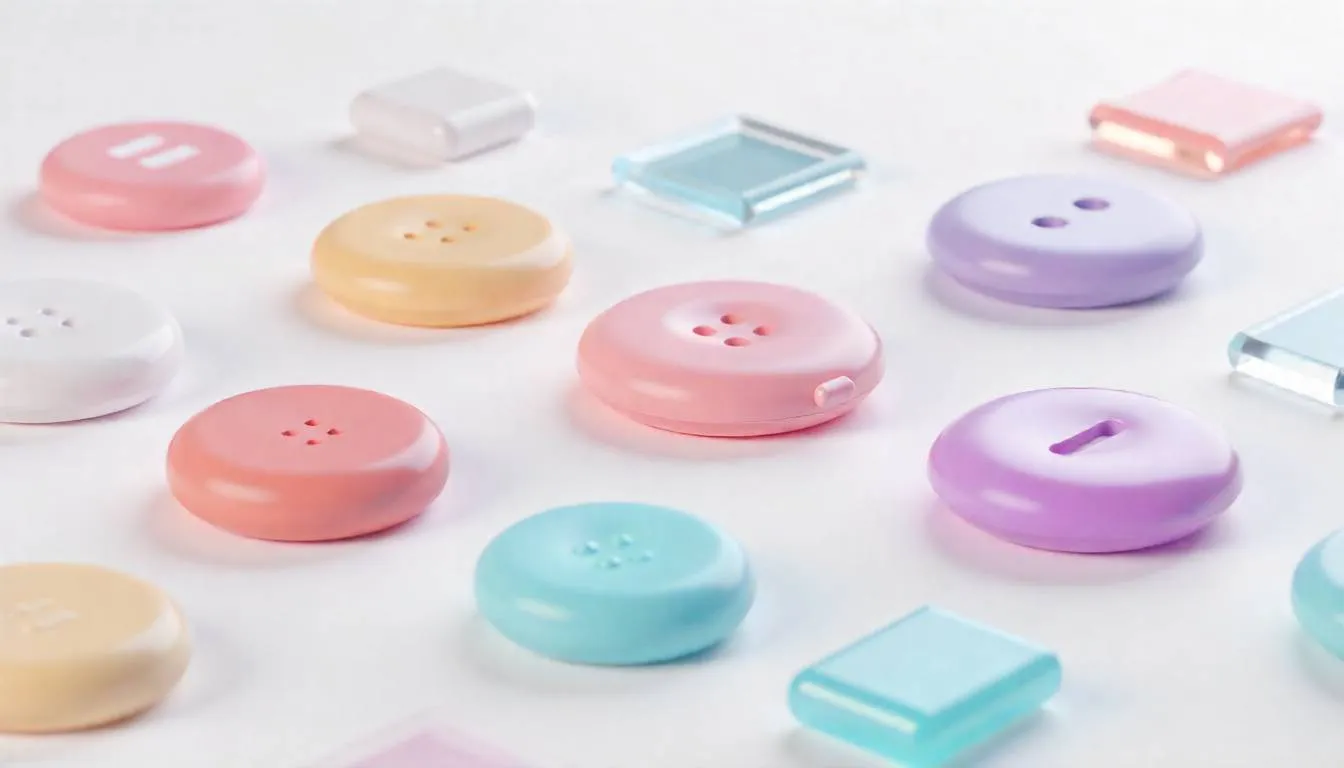
What Is Tactile Maximalism?
Tactile Maximalism is a design philosophy where:
- Interfaces feel physical, not flat
- Elements behave like materials (jelly, clay, chrome, glass)
- Motion communicates intent, not decoration
Think:
- Buttons that bulge when pressed
- Cards that wobble with momentum
- Icons that inflate, stretch, or snap back
This isn’t skeuomorphism 2.0.
It’s physics-aware design powered by real-time computation.
Where Generative UI Fits In
Generative UI uses AI and logic systems to:
- Adapt layout, motion, and density based on user intent
- Change interaction patterns in real time
- Respond differently to hover, scroll, tap, or hesitation
The interface becomes a conversation, not a canvas.
Case Study: Blinkit’s “Festive Pluck” Interface
Nothing explains this better than Blinkit’s 2026 festive redesign.
The Problem
During holiday seasons:
- Standard e-commerce grids felt cold
- Festive campaigns didn’t feel festive
- Users browsed but didn’t commit
The UI was efficient—but emotionally flat.
The AI-Powered Design Shift
Blinkit introduced a Tactile Maximalist layer on top of its core UX:
- High-gloss 3D festive icons
- “Inflatable” product tiles
- Physics-based hover interactions
When users hovered over items like sweets or gifts:
- The icon expanded
- The surface deformed
- The motion suggested “pluck me”
It felt playful. Almost irresistible.
The Result
- Massive spike in micro-interactions
- 30% increase in add-to-cart rates
- Longer session times without friction
Nothing about pricing or logistics changed.
Only the feeling did.
Why This Works: The Psychology Behind Squishy UI
This trend isn’t just aesthetic—it’s neurological.
1. Motion Signals Affordance
When something moves like an object, the brain assumes:
“I can interact with this.”
Flat elements don’t trigger that instinct.
2. Deformation Feels Rewarding
Squish, bounce, and resistance activate:
- Dopamine loops
- Play instincts
- Curiosity-driven exploration
That’s why users keep “playing” with the UI.
3. Micro-Interactions Build Emotional Memory
Users may forget your headline.
They remember how your product felt.
How to Apply Tactile Maximalism (Without Breaking UX)
This isn’t about turning your site into a toy.
Here’s how to do it strategically.
Step 1: Design for Intent, Not Screens
Ask:
- What is the user trying to do right now?
- Where is hesitation happening?
Apply tactile feedback at moments of:
- Decision
- Confirmation
- Exploration
Step 2: Use Maximalism Selectively
You don’t need everything to squish.
Focus on:
- Primary CTAs
- Featured products
- Promotional elements
Contrast makes the effect powerful.
Step 3: Combine with Modern Layout Systems
Yes, Bento Grid Layouts (2026) still matter. But now they:
- Break symmetry
- Allow depth layering
- Support motion overflow
Pair them with:
- Anti-Grid Web Design principles
- Responsive Glassmorphism for depth
- Kinetic Typography AI for expressive copy
Step 4: Make It Adaptive with AI
Static animation gets old fast.
Generative UI systems:
- Adjust motion intensity by device
- Reduce effects for accessibility
- Learn which interactions convert
This is where platforms like SaaSNext quietly shine—helping teams orchestrate AI-driven UX logic, personalization, and behavioral triggers without rebuilding their entire frontend stack.
Common Mistakes to Avoid
- ❌ Over-animating everything
- ❌ Ignoring performance budgets
- ❌ Treating motion as decoration
- ❌ Forgetting accessibility and motion preferences
Tactile Maximalism is about feedback, not flash.
What This Means for Marketers & Founders
If you’re:
- An e-commerce founder fighting conversion plateaus
- A solo marketer needing differentiation without bigger budgets
- An agency owner pitching “something new” to clients
This trend is leverage.
You’re not just redesigning.
You’re re-sensitizing users to your brand.
And when paired with AI-driven workflows—like those enabled by SaaSNext—you can test, adapt, and optimize these experiences in real time instead of guessing what “looks cool.”
AEO-Friendly Quick Answers
Is flat design officially dead?
Not dead—but no longer dominant. It’s becoming the baseline, not the differentiator.
Does Tactile UI hurt performance?
Not when done right. Modern GPU acceleration and adaptive motion keep experiences smooth.
Is this trend accessible?
Yes, when motion scales with user preferences and intent.
The Bigger Shift: From Interfaces to Experiences
The real change isn’t visual.
It’s philosophical.
In 2026:
- Interfaces don’t just respond
- They express state, intention, and emotion
Design is no longer about clarity alone. It’s about felt understanding.
Stop Designing Screens. Start Designing Feelings.
Flat design helped us survive the mobile revolution.
Tactile Maximalism will help us stand out in the AI era.
Because when everything is fast, automated, and optimized— the brands that win are the ones that still feel human.
If this sparked ideas:
- Share it with your design or growth team
- Subscribe for future-forward UX and AI strategy insights
- Explore how SaaSNext helps teams turn static funnels into adaptive, intent-driven experiences
Your users are ready to feel something again.